

Walnut flooring provides a rich, luxurious foundation for a dining room. Walnut is a rare wood species in America but its a truly a royal touch to your eating hall. Now its time to get the right wall color to bask in the presence of your gem of walnut hardwood. The perfect hue is within the eye of the beholder, so we decided to list some ideas and pictures to help to plan for an epic home improvement project.
Walnut floors with a natural finish on them create a eye-stopping look you can't get from other wood types. Your choice of color in this room will mostly likely come secondary to this striking hardwood choice.
This comprehensive guide will walk you through some safe color palettes for you to build on with your own taste. The name of the game is to complement the deep, warm tones of walnut floors and the contrasting cream colored sapwood in various planks. We'll cover everything from timeless neutrals to bold, dramatic shades to help you find the ideal dining room color with walnut floor that reflects your personal style and creates the perfect atmosphere for memorable meals and gatherings.
First, Understand the Undertones in Walnut Hardwood

Before diving into specific paint colors for walnut flooring, it's essential to understand that walnut isn't just "dark brown." This sophisticated hardwood features complex undertones that can dramatically influence your color choices. Walnut floors often showcase hints of red, gold, chocolate, or even subtle purple notes, depending on the specific cut, finish, and age of the wood.
Identifying these undertones is the key to creating a unqiue but non-tacky look. A walnut floor with prominent reddish undertones will pair beautifully with different colors than one with cooler, chocolatey tones. The undertones in your flooring should guide your wall color selection to ensure everything works together seamlessly.
Actionable Tip for Identifying Undertones: Examine your walnut floors in different lighting conditions throughout the day. Look at them in bright natural daylight streaming through windows, under warm evening lamplight, and with overhead fixtures turned on. The dominant undertones will become more apparent as the lighting changes, helping you make informed decisions about complementary wall colors.
The Best Color Palettes for a Dining Area with Wood Accents
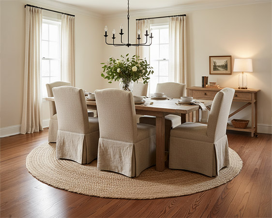
1. Warm Neutrals: For a Cozy & Inviting Atmosphere

Warm neutrals represent the most popular choice for wall colors to match dark wood floors because they create an instantly welcoming and sophisticated environment. These colors work by leaning into the inherent warmth of walnut flooring, creating a cohesive and inviting space perfect for both casual family dinners and formal entertaining.
Top Warm Neutral Paint Colors:
| Color Category | Specific Examples | Why It Works |
|---|---|---|
| Creamy Off-White | Benjamin Moore Swiss Coffee, Sherwin-Williams Ivory Lace | Creates soft contrast without stark brightness; highlights wood richness |
| Greige (Gray + Beige) | Sherwin-Williams Agreeable Gray, Benjamin Moore Revere Pewter | Perfect balance of warmth and modernity; sophisticated yet welcoming |
| Warm Tan/Beige | Benjamin Moore Grant Beige, Sherwin-Williams Accessible Beige | Classic monochromatic feel that seamlessly blends with wood tones |
Creamy off-whites like Benjamin Moore's Swiss Coffee create a soft, warm contrast without the starkness of pure white, allowing the richness of your walnut floors to take center stage. These colors reflect light beautifully, making your dining room feel larger and more open while maintaining that cozy, intimate feel perfect for meal times.
Greige colors offer the perfect balance between contemporary gray and traditional beige warmth. Sherwin-Williams' Agreeable Gray has become incredibly popular in modern homes because it provides sophistication while remaining approachable and family-friendly. This color works especially well in dining rooms because it photographs beautifully and complements both traditional and contemporary furniture styles.
2. Cool Contrasts: For a Modern & Elegant Look

Cool tones provide a stunning visual contrast that allows walnut flooring to stand out as a key design feature in your dining room. These colors work particularly well in contemporary and minimalist spaces where you want to highlight the natural beauty of your wood floors.
Recommended Cool Contrast Colors:
-
Light Cool Gray: Provides crisp, clean contrast that makes walnut floors pop dramatically. Colors like Benjamin Moore's Classic Gray or Sherwin-Williams' Misty create an elegant, gallery-like backdrop that's ideal for showcasing beautiful dining furniture and artwork.
-
Soft Blue-Gray: Introduces subtle color while maintaining sophistication. Sherwin-Williams' Distance or Benjamin Moore's Healing Aloe offer serene, spa-like qualities that balance the warmth of walnut beautifully.
-
Charcoal Gray (Accent Wall): Creates dramatic depth when used strategically. Consider Sherwin-Williams' Iron Ore or Benjamin Moore's Wrought Iron for a statement wall behind a sideboard or buffet.
The key to success with cool contrasts is ensuring your dining room receives adequate natural light. North-facing rooms may feel too cold with these colors, while south-facing spaces can handle the coolest tones beautifully. Always test paint samples in your specific lighting conditions before committing to cool colors.
3. Rich Jewel Tones: For a Dark Dramatic & Luxurious Vibe

Dark, saturated jewel tones create an intimate, opulent atmosphere perfect for formal dining rooms. These colors make a bold statement while allowing walnut floors to ground the dramatic color choices, preventing the space from feeling overwhelming.
Popular Jewel Tone Choices:
| Color Family | Specific Shades | Design Impact |
|---|---|---|
| Deep Navy Blue | Benjamin Moore Hale Navy, Sherwin-Williams Naval | Timeless elegance; works with gold and brass accents |
| Emerald/Forest Green | Benjamin Moore Hunter Green, Sherwin-Williams Evergreens | Natural luxury; connects to wood's organic origins |
| Burgundy/Deep Red | Benjamin Moore Caliente, Sherwin-Williams Fired Brick | Rich formality; complements red undertones in walnut |
Deep navy blue has emerged as one of the most sophisticated choices for dining rooms with walnut floors. This color creates a stunning backdrop for metallic accents, crystal chandeliers, and elegant table settings. Navy works year-round and photographs beautifully, making it perfect for those who love to entertain and share their space on social media.
Emerald or forest green colors connect to the natural origins of wood while evoking classic luxury. These colors work exceptionally well with brass hardware, copper accents, and rich fabrics like velvet or silk. The organic feel of green creates a connection between your indoor dining space and the natural world outside.
4. Earthy & Muted Tones: For a Natural & Grounded Feel

Earthy, muted tones drawn from nature create the most harmonious relationship with walnut flooring because both the paint colors and wood originate from natural sources. These colors work beautifully in casual dining spaces and homes with organic, bohemian, or rustic design aesthetics.
Natural Earth Tone Options:
-
Sage or Moss Green: Soft, calming colors like Benjamin Moore's Saybrook Sage or Sherwin-Williams' Clary Sage complement natural wood beautifully while creating a relaxing, organic atmosphere.
-
Terracotta or Muted Ochre: Warm earth tones like Sherwin-Williams' Cavern Clay (2019 Color of the Year) add warmth and rustic character while maintaining sophistication.
These colors create environments that feel grounded and peaceful, perfect for long, leisurely meals with family and friends. They work particularly well in dining rooms that open to kitchens or outdoor spaces, creating seamless flow throughout your home.
Pro Tip: Don't Forget Trim and Ceiling Colors
The most beautiful wall color can fall flat without proper attention to trim and ceiling colors. These finishing touches are crucial for creating a polished, intentional look in your dining room.
Trim Color Recommendations: Crisp white trim remains the most popular choice because it frames your wall color beautifully and makes it appear cleaner and more intentional. Benjamin Moore's Simply White or Sherwin-Williams' Pure White provide the perfect contrast against both light and dark wall colors while complementing walnut floors.
For a more sophisticated approach, consider painting trim in a slightly lighter version of your wall color. This creates a more subtle, monochromatic look that feels custom and high-end.
Ceiling Color Strategy: A flat, bright white ceiling is usually your best choice, especially when using darker wall colors. White ceilings make rooms feel taller and more open while reflecting light throughout the space. In dining rooms with walnut floors and dramatic wall colors, a white ceiling prevents the space from feeling enclosed or cave-like.
Factors to Consider Beyond the Paint Chip
Choosing the perfect dining room color with walnut floor involves more than just picking a beautiful paint chip. Several environmental and design factors will influence how your chosen color actually looks and feels in your specific space.
Natural Light Assessment: The amount and quality of natural light in your dining room significantly impacts color perception. North-facing rooms receive cooler, more consistent light throughout the day and may benefit from warmer wall colors to create an inviting atmosphere. South-facing dining rooms receive warmer, brighter light and can successfully handle cooler color palettes.
East-facing rooms enjoy warm morning light but cooler afternoon light, while west-facing spaces experience the opposite pattern. Consider when you use your dining area most frequently and choose colors that look their best during those times.
Space and Size Considerations: Lighter colors naturally make small spaces feel larger and more open, while darker colors can make oversized dining rooms feel more intimate and cozy. If your current spot feels too large or impersonal, consider rich jewel tones or deep neutrals to create a more intimate atmosphere. For smaller spaces, stick with warm neutrals or cool light colors to maximize the feeling of a kindgom hall.
Existing Furniture Integration: Your dining table color should complement and enhance your existing furniture pieces. Consider the undertones in your dining table, chairs, sideboard, and area rug when making color choices. A mahogany dining table will work differently with wall colors than a lighter oak piece, even when both are paired with walnut floors.
Desired Ambiance Creation: Different colors create distinctly different moods in dining spaces. Warm neutrals feel casual and family-friendly, cool grays appear modern and sophisticated, jewel tones create formal elegance, and earth tones provide organic warmth. Choose colors that make you feel good and makes you smile.
Interior Design Tips for Walnut Floor Color Schemes
Creating successful walnut floor color schemes is all about trial and error in my opinion. You can lean on expert advice to get started, but shoot for something unique. Here are professional interior design strategies for maximizing the impact of your color choices:
Layer Different Shades: Don't rely on a single wall color to carry your entire design. Layer different shades of your chosen color family through accessories, artwork, and textiles. If you choose a sage green wall color, incorporate deeper forest green in dining chair cushions and lighter seafoam green in artwork or table linens.
Balance Warm and Cool Elements: Even if you choose a predominantly warm or cool color palette, incorporating small amounts of contrasting temperature colors creates visual interest and prevents the space from feeling flat. Cool gray walls might include warm brass lighting fixtures, while warm beige walls could feature cool silver picture frames.
Consider Seasonal Flexibility: Choose wall colors that can adapt to seasonal decorating changes. Neutral base colors allow you to switch out accessories, table linens, and centerpieces to reflect different seasons without repainting. This flexibility is particularly valuable in dining rooms where you may want to create special atmospheres for holidays and celebrations.
Common Mistakes to Avoid When Choosing Dining Room Colors
Understanding what doesn't work can be just as valuable as knowing what does when selecting paint colors for walnut flooring. Here are common mistakes that can undermine your dining room design:
Matching Too Closely: Avoid choosing wall colors that too closely match your walnut floors. This creates a monochromatic look that lacks visual interest and can make your beautiful flooring disappear into the background. Always ensure sufficient contrast between walls and floors.
Ignoring Artificial Lighting: Many homeowners choose colors based solely on natural daylight without considering how the space will look under artificial lighting in the evenings. Test your color choices under both natural and artificial light sources, especially since dining rooms are frequently used for evening meals.
Overlooking Furniture Scale: Large, dark furniture pieces will impact how wall colors appear in your space. If you have a substantial dining table and chairs, lighter wall colors may be necessary to prevent the room from feeling too heavy or overwhelming.
Styling Your Dining Room: Bringing Colors Together
Once you've chosen the perfect wall color for your walnut floors, styling becomes crucial for creating a cohesive, beautiful space. Here are professional tips for bringing all elements together:
Artwork and Wall Decor: Choose artwork that bridges the colors in your walnut floors and wall paint. For example, if you've chosen sage green walls with walnut floors, look for artwork that incorporates both green tones and warm wood brown shades.
Lighting Selection: Lighting fixtures should complement both your flooring and wall colors. Warm brass or bronze fixtures work beautifully with warm wall colors and walnut floors, while chrome or brushed nickel fixtures pair well with cooler color palettes.
Table Linens and Accessories: Use table runners, placemats, and centerpieces to echo your wall colors and create visual flow throughout the room. This repetition of color creates a designed, intentional look that feels professionally decorated.
Conclusion: Your Perfect Dining Room Awaits
Walnut flooring provides an incredibly versatile foundation for dining room design, pairing beautifully with warm neutrals for cozy family meals, cool grays for modern elegance, and deep jewel tones for dramatic formal entertaining. The key to success lies in understanding your floor's specific undertones and considering your room's lighting, size, and existing furnishings.
The best approach to choosing the perfect dining room color with walnut floor is systematic: identify your floor's undertones, assess your room's natural light, consider your lifestyle and entertaining needs, and always test color samples in your specific space. Remember that the most beautiful paint color in a magazine may not work in your particular dining room due to lighting, size, or furniture considerations.
Ready to Transform Your Space? Don't skip the crucial step of testing paint samples! Purchase sample sizes of your top color choices and paint large swatches directly on your walls. Observe these samples throughout different times of day and under various lighting conditions for at least 48 hours before making your final decision. This extra step will ensure you're completely satisfied with your choice and help you create the dining room of your dreams.
Your perfect dining room color combination awaits – one that celebrates the natural beauty of your walnut floors while creating the exact atmosphere you desire for memorable meals and gatherings.
Frequently Asked Questions (FAQ)
Q1: What is the most popular wall color for dark wood floors? A: Warm off-whites and light greige colors like Sherwin-Williams Agreeable Gray and Benjamin Moore Swiss Coffee are consistently popular because they create bright, inviting spaces while providing beautiful contrast with dark floors. These colors work well in both traditional and contemporary dining rooms and complement most furniture styles.
Q2: Can I paint my dining room walls dark gray if I have walnut floors? A: Absolutely! Charcoal or dark gray walls can create a very sophisticated, dramatic look with walnut floors. However, ensure your dining room receives adequate natural light and consider incorporating lighter-colored furniture, artwork, and accessories to create visual balance. Test dark colors carefully, as they can make rooms feel smaller.
Q3: Should my wall trim match my walnut floors? A: Generally, it's not recommended to match wood trim to wood floors, as this can create a flat, monochromatic look. Instead, paint trim in a contrasting color like crisp white to define the space and make both walls and floors stand out. White trim also makes your chosen wall color appear more intentional and polished.
Q4: How do I know if my walnut floors have warm or cool undertones? A: Examine your floors in different lighting conditions throughout the day. Walnut with warm undertones will show hints of red, gold, or amber, especially in natural sunlight. Cool-toned walnut may appear more chocolate brown or show subtle purple notes. The undertones become more apparent when you place white paper or fabric next to the flooring.
Q5: What colors should I avoid with walnut floors? A: Avoid colors that clash with your floor's undertones. If your walnut has red undertones, be cautious with green wall colors that might create an unflattering contrast. Also avoid colors that are too similar to your flooring, as this lacks visual interest. Pure white can sometimes appear too stark and cold against warm walnut tones – opt for warm off-whites instead.


