


Before you buy a new tub of paint to compliment red oak hardwood lets cover some color theory. Especially if you're trying to do this without your wife's direction! Red oak can mess with ya if you're not careful!
Red oak will show lots of wood grain and warm reddish-orange undertones in each hardwood plank. Balancing a natural stain or a strong stained color with a neutral wall paint is the goal to match your home decor vision.
Your wall paint only needs complement the floor, it doesn't need to be the main design choice you make for you home. I'm here to help you not pick colors that won't clash with this beautiful wood floor type. Matching a visually interesting hardwood like red oak is fun!
Table Of Contents:
- Understanding Red Oak Flooring
- Best Paint Colors for Natural & Light Red Oak Floors
- Wall Colors That Complement Medium Brown Red Oak
- Refined Paint Pairings for Dark Stained Red Oak
- Colors to Avoid
- Creating Contrast and Harmony
- Matching Red Oak Flooring with Other Design Elements
- Furniture
- Trim
- Accents
- Considerations for Room Size and Lighting
- The Secret to Success: Neutralizing Red Oak's Undertones
- FAQs about Wall Colors Matching With Red Oak Floors
- The End of Your Match
Understanding Red Oak Flooring
Before deciding what color walls go with red oak floors, you need to understand their inherent characteristics. Red oak flooring boasts warm reddish-orange undertones that can range from light to medium shades.
This characteristic warm tone is key to making informed paint choices that complement the floor, rather than clash with it. Additionally, red oak has prominent graining, which adds visual interest and a natural, rustic charm to the room. Consider how the grain pattern might interact with your wall color choice to create different moods.
Featured Product: Contractor's Choice Red Oak Natural
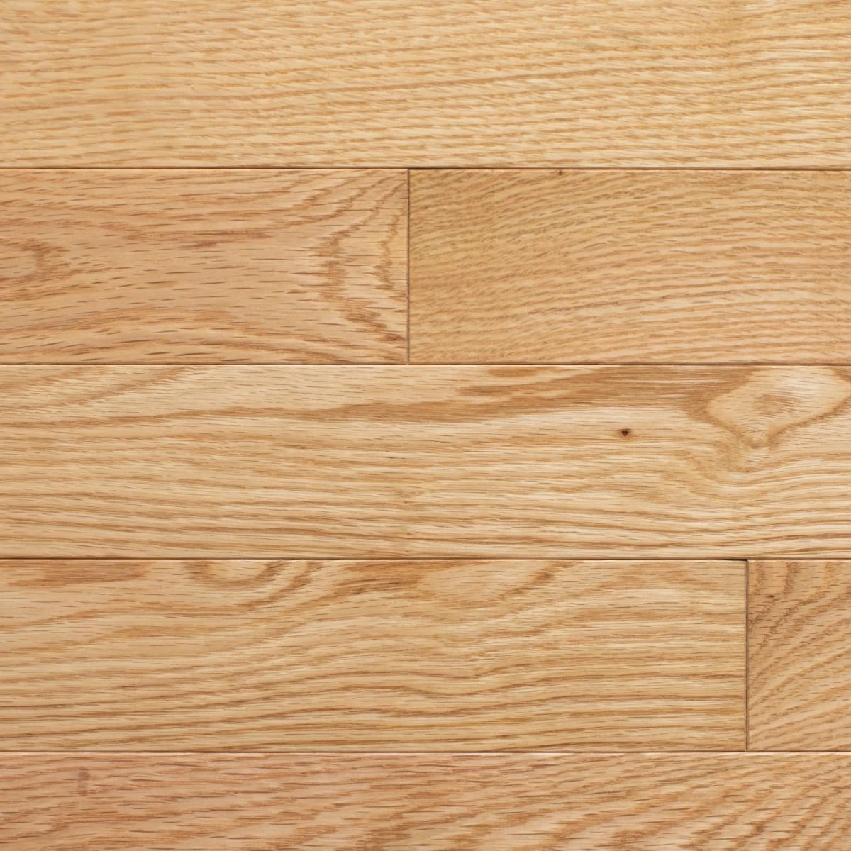
Contractor's Choice - Red Oak Natural
Price: 2.39/sq ft
- Species: Red Oak
- Width: 3"
- Thickness: 3/4"
A beautiful and durable choice, this Contractor's Choice Red Oak flooring offers a timeless, natural finish perfect for any remodeling project.
Learn more about this productBest Paint Colors for Natural & Light Red Oak Floors

Many Natural options come in a more light wood look. A brighter color will bring a more relaxed and airier feel to a home. Walls painted with cool and muted pale blues, soft greens, or light grays compliment well. These colors provide a nice contrast with the warmth of the floor without overwhelming the room.
Examples include shades like a Benjamin Moore Chantilly Lace, which provides a clean, crisp contrast against the reddish wood floor. Allow the light and natural wood floors to stand out. Another expert-recommended pick is the Sherwin Williams Sea Salt for a calming, slightly more colorful backdrop.
Examples include shades like Benjamin Moore's Chantilly Lace, which provides a clean, crisp contrast against the floors, allowing the light wood floors to stand out. Another expert-recommended pick is Sherwin Williams' Sea Salt for a calming, slightly more colorful backdrop.
Wall Colors That Complement Medium Brown Red Oak

Medium brown red oak floors strike a balance between light and dark tones. The color grain in this type of wood has drastic color variations. You can experiment with richer, more saturated hues without creating a jarring contrast. Think of deep teals, earthy greens, or a warm beige.
These tones complement a more brown color floor to bring out its richness. With a medium-brown and slightly yellow streaked floor, you have more flexibility to play with different moods in a paint colour.
Refined Paint Pairings for Dark Stained Red Oak

Dark red oak floors bring a sense of sophistication and warmth. If you’re working with red-toned hardwood like cherry, Sherwin-Williams color experts recommend balancing the red hues with cooler shades like cool whites, lighter blue tones, and cooler grays.
This creates an elegant ambiance that you can further enhance by using brighter wall colors as accents. Dark hardwood floors provide a beautiful contrast against white hardwood in your trim.
Refined Paint Pairings for Dark Stained Red Oak
Creating Contrast and Harmony

Red oak has a unique personality. Understanding this lets you leverage color contrasts to highlight certain features. To make the room feel larger, designers recommend going at least three shades lighter on the walls compared to the floor color.
As a homeowner, matching your wood species undertones and wall paint colors is a key interior design decision. But this principle also extends to choosing accent wall colors and furniture pieces. These additions can complement the existing palette or introduce intentional pops of color for greater visual interest.
Matching Red Oak Flooring with Other Design Elements
Now that you have an idea of what color walls go with red oak floors, remember that they’re part of a larger picture. It's vital to ensure a sense of harmony between wall colors and other elements like furniture, trim, and accents.
Furniture

Your choice of furniture will significantly influence how well your chosen wall color harmonizes with red oak flooring. Dark furniture with light-colored walls can create an elegant contrast that makes the room appear more spacious. Conversely, light-colored furniture pairs nicely with richer, more saturated wall colors.
It all boils down to personal preference and achieving the right level of contrast. Consider what kind of mood you'd like to set in the room. A light and airy dining room might do best with lighter furniture, while a cozy living room with a gray wood floor could suit darker furniture.
Trim
When it comes to trim, white is the classic choice. This combination creates a clean and bright look, regardless of your chosen paint color. The experts at Improovy suggest sticking with a crisp white like Extra White from Sherwin Williams.
Avoid warmer or yellowish whites, as these may make your trim look dated. White trim also allows your oak wood to stand out, whether you have honey oak floors or a darker stain.
Accents

Don't be afraid to experiment with accents. They can be an excellent way to inject your personality. Cushions, throws, rugs, and artwork can feature bolder colors, contrasting against both walls and floor.
These accents can tie the entire room design together for a cohesive and eye-catching look. They also introduce dynamism to what would otherwise be a monotonous palette. When choosing accent colors, you might draw inspiration from the color palette found in your oak wood.
Considerations for Room Size and Lighting
Room size and lighting can also affect your final decision on wall colors. If you have a small room with limited natural light, light-colored walls will help make the space feel larger and brighter.
In this case, whites, creams, or light pastels will work best. Larger, well-lit rooms can accommodate darker wall colors without feeling closed-in or cramped. The key is to find the right balance that best suits the unique features of your room, and remember the impact of wood color on the overall feel.
The Secret to Success: Neutralizing Red Oak's Undertones
The biggest challenge with red oak is its inherent pink or orange undertones. The secret to a modern look lies in color theory. On the color wheel, green is the opposite of red, which means it visually cancels it out. You don't need green walls, but choosing paint colors with subtle green, blue, or cool gray (ashy) undertones is the key to neutralizing the warmth and achieving a balanced, sophisticated look.
Pro-Tip from Ted Cook: A common mistake is choosing paint from a small sample square under store lighting. Always get a paint sample and test it on a poster board or scrap wood laying around. Move that board around the room at different times of day to see how the natural light interacts with your floors before you commit.
Upgraded Paint Color Recommendations
For a crisp, modern look that makes the wood pop, you can't go wrong with a clean off-white like Benjamin Moore Chantilly Lace. For a color with more depth, Sherwin Williams Sea Salt is a fantastic choice because its subtle green-gray undertones directly neutralize the red in the oak for a calm, coastal feel.
-
2025 Paint Color Ideas for Red Oak Floors by Style
Interior design is moving beyond simple grays. For 2025, the focus is on creating a specific mood with warmer, more complex neutrals and earthy tones. Here are some top paint ideas organized by the style you want to achieve.
For a Light & Airy Modern Look
Focus on cool off-whites and light, cool grays to create a clean, spacious feel that lets your red oak floors be the star.
- Benjamin Moore: Chantilly Lace
- Sherwin-Williams: Repose Gray
- Behr: Silver Drop
For a Warm & Earthy "Japandi" Vibe
This is a huge trend that blends Japanese minimalism with Scandinavian function. Introduce warm whites and complex greiges (gray + beige) for a cozy yet sophisticated feel.
- Sherwin-Williams: Agreeable Gray
- Benjamin Moore: Revere Pewter
- Farrow & Ball: Elephant's Breath
For a Calming, Natural Feel
Introduce the popular sage and muted green trend. These colors have natural red-neutralizing undertones and create a serene, organic space.
- Sherwin-Williams: Evergreen Fog
- Benjamin Moore: October Mist
- Behr: Laurel Tree
For a Sophisticated & Moody Ambiance
Recommend deep, cool tones for a dramatic and elegant backdrop that makes the warmth of the red oak feel intentional and luxurious.
- Benjamin Moore: Hale Navy
- Sherwin-Williams: Iron Ore (a soft charcoal)
Quick-Reference Paint Pairing Chart
If Your Red Oak is... For a Modern, Airy Vibe For a Warm, Earthy Feel For a Bold, Sophisticated Look Natural / Light Cool Off-White (BM Chantilly Lace) Greige (SW Agreeable Gray) Sage Green (SW Evergreen Fog) Medium Brown Light Cool Gray (SW Repose Gray) Warm White (SW Alabaster) Deep Blue (BM Hale Navy) Dark / Cherry Stained Crisp White (SW Extra White) Light Greige (BM Revere Pewter) Charcoal (SW Iron Ore) FAQs about Wall Colors Matching With Red Oak Floors
Should Floors be Darker or Lighter than Walls?
It's typically better to go with a darker shade for the floors compared to the walls. This allows the floor to act as an anchor, giving the room visual grounding. This is especially important when working with a color hardwood like red oak.
What Color Paint Goes Best with Oak Wood?
Many shades pair well with oak. Popular choices for lighter red oak include light blues, soft greens, or pale yellows. For darker oak, think about deep teals, rich browns, and warm grays.
Ultimately, your perfect pairing will depend on the specific undertones of your red oak and how much contrast you'd like in the space.
What Matches Red Wood Floors?
There is a good deal of flexibility here, but a safe choice would be greens and blues that provide subtle contrast to red tones. Creamy off-whites, deep browns, and some grays can also pair well depending on the undertones and darkness of the red oak hardwood.
It can help to look at color palettes designed to complement wood, as this will give you a starting point.
What Color Walls Match Hardwood Floors?
The best match really hinges on the type of hardwood. For warmer-toned woods like red oak, consider cooler wall colors for contrast and a more spacious feel. Cool whites, light blues, greens, and muted grays work nicely.
For cool-toned hardwood, lean toward warm, earthy wall colors to add some cozy vibes. When thinking about your color scheme, imagine the impact of the room furniture against both the walls and floors.
The End of Your Match
Matching wall colors with red oak floors can feel daunting at first. However, our descriptions of color undertones should put these feelings at ease. The effects of undertone contrast opens the possibilities of your new decor.
Red oak’s warm, rich tones is a versatile base for many interior design themes. You can use clean whites that enhance airiness or sophisticated grays that evoke calm and warmth. Your vision is not locked down to oranges or beige.
Ultimately, a one-size-fits-all solution doesn't exist. It's about planning around undertones, lighting, and room sizes. The broader design aesthetic is up to you. This post is here to build your confidence to choose colors decisively. We want you to create the perfect atmosphere for your home.


